Recent Years


Taikoo Li Qiantan
Location: Shanghai, China
Size: Approximately 1.24 million sq ft (over 120,000 sqm) , over 250 shops and restaurants
Client: Taikoo Properties
Completion Date: 2021
Taikoo Li Qiantan is the third Taikoo Li project in China, thoughtfully zoned into the “Wood House” and “Stone House” zones, each characterized by distinct finishes that reflect their unique identities. Our design approach emphasizes wellness and growth, symbolizing the project’s evolution within the Taikoo Li family. To enhance the user experience, we have integrated innovative digital elements into the signage system, creating a dynamic and engaging environment that fosters exploration and connection.


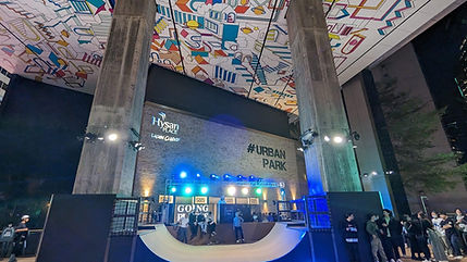
Hysan Place
Location: Hong Kong, China
Size: The shopping mall occupies roughly 600,000 sqft, office tower around 500,000 sqft
Client: Hysan Development
Completion Date: On Going
For the Hysan Place shopping mall and office tower, we designed the graphic elements, wayfinding, and signage to complement the ongoing renovations and the vibrant environment. Our approach combines a modern and contemporary aesthetic with a youthful and energetic vibe, ensuring that the design resonates with the dynamic atmosphere of the development. By integrating creative visual elements, we aimed to enhance navigation and create an engaging experience for visitors and tenants alike.


M Social Hotel Auckland
Location: Auckland, New Zealand
Size: 4-star boutique hotel featuring 240 guest rooms
Client: Millennium Hotels and Resorts
Completion Date: 2017
As the signage and environmental graphic designer for M Social Hotel Auckland, we embraced a creative and playful approach to the project. The design features unique direction signs inspired by Scrabble, alongside upside-down graphics that reflect New Zealand’s identity as “down under,” situated at the bottom of the Earth. This innovative visual language embodies the hotel’s overall theme of creativity, enhancing the guest experience and emphasizing the vibrant spirit of Auckland.
(with Aedas)


Benenden School Guangzhou
Location: Guangzhou, China
Size: 1000,000 sqm
Client: CTF Education Group
Completion Date: 2023
Benenden School Guangzhou, an extension of the prestigious UK institution, is committed to providing a high-quality British education that fosters academic excellence and personal growth. Our wayfinding and signage design incorporates the school’s brand color, blue, as the primary accent, symbolizing trust and professionalism.
Actuated forms and designs of the signage are inspired by books, giving it an academic look and feel. Recognizing the diverse user base—including students, parents, and visitors—we prioritized user-friendly design elements. Our signage is intuitive and easily navigable, ensuring that everyone can access important information and find their way around the campus with ease. This thoughtful approach enhances the overall experience, creating a welcoming atmosphere that supports the school’s educational goals while guiding users seamlessly throughout the space.


Citywalk, Universal Beijing
Location: BEIJING, China
Size: Approximately 1.1km in length, 200,000 sqm
Client: Universal Studios
Completion Date: 2021
Universal Beijing Resort’s CityWalk is an engaging entertainment hub designed to enhance the visitor experience before and after exploring the theme park. Our work on the graphics, wayfinding, and signage design, along with the visual identities for several restaurants, reflects the vibrant spirit of the CityWalk.
Drawing inspiration from the dragon scale, a symbol deeply rooted in Beijing’s culture and heritage, we infused this design motif throughout the project. This element serves as a dynamic representation of the location while encouraging user interaction and engagement. The playful and fun aspects of our design invite guests to explore and enjoy the space, creating memorable experiences that resonate with the rich cultural backdrop of Beijing.


Changi Airport Terminal 4
Location: Singapore
Size: 225,000 sqm
Client: CAG
Completion Date: 2017
Changi Airport Terminal 4 (T4) is a modern and innovative terminal that enhances the travel experience with its seamless design and operational efficiency. In our scope of work for T4, we adopted a stronger branding approach, drawing inspiration from the petals of the orchid, Singapore’s national flower. This motif was creatively integrated into the graphics and signage system to reflect Singapore’s identity and culture. Consistency was a key focus throughout the project, ensuring that all design elements harmonized to create a cohesive and visually appealing environment for travelers.
(with Benoy)


